Let's Talk About Museum Branding
This gave the exhibit design a unique look that related to the subject matter and gave the
marketing and web team plenty of options to incorporate Bree Serif into more of the marketing while the subhead related to the Museum.
marketing and web team plenty of options to incorporate Bree Serif into more of the marketing while the subhead related to the Museum.
Digital Mock-up of the exhibition title wall. [Seen here is the title logo displayed beside 4 photos from the exhibit and some introductory text. Silhouette of a woman and child appear in front to indicate scale.]
See more tips
on how to design a museum exhibition logo and more examples on my blog.
on how to design a museum exhibition logo and more examples on my blog.
Remember the best branding is clear and consistent. So, whatever you choose, keep it simple!
To show you what I mean, check out Vulcan Park & Museum’s Right or Privilege exhibit. I created a title logo that used Bree Serif from Google as the main header and Trade Gothic from the Museum’s own branding for the subhead.
Set the main exhibit title in a unique typeface and style the subtitle in your museum brand’s font.
But my best tip?
If it’s a longer title, you may need to stack vertically to fit the entire design on your title
wall. Select a font that is readable. Varying weights, sizes, and fonts between main title and subtitle will establish hierarchy and highlight the main title. Pay attention to how letters fit together and don’t forget to kern - adjust spacing between letters - when needed.
wall. Select a font that is readable. Varying weights, sizes, and fonts between main title and subtitle will establish hierarchy and highlight the main title. Pay attention to how letters fit together and don’t forget to kern - adjust spacing between letters - when needed.
When designing your exhibition logo, type is the most important piece. Your title is how people will recognize and talk about your exhibit.
Unique font for main title, museum font for subtitle
For historical exhibits, select a font that was popular during that time period
Only use 1-2 fonts on your marketing materials
And 2-3 colors, depending on the graphic and images included
Create a color system if you can - if the main palette has blue, green, and orange, make all general program images in blue and children's programs in green, etc.
Connect with curatorial on what colors will be used inside the galleries and repeat those in your marketing
Have 2 options for your exhibit logo ready. It's better to take extra time in the beginning to have a horizontal and vertical option ready that it is to work with tricky spacing issues later.
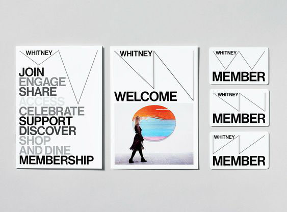
Examples of Museum Branding
The Whitney has one of the most distinct and recognizable brands due to its use of stark white and thin lines.
Statement from the Museum: "The [brand] is a distinctive and inventive graphic system that literally responds to art—a fundamental attribute of the Whitney since its founding in 1930. This dynamic identity, which the designers refer to as the “responsive ‘W’”, also illustrates the Museum’s ever-changing nature."
See the full brand case study from the design team at Experimental Jetset.
See more examples on my Museum Branding Examples Pinterest Board

Let's Talk About Museum Exhibition Branding
Just like it’s important to have a clear and recognizable style for your museum, it’s just as important to brand individual exhibitions and events. It's how your audience will recognize your efforts and messaging specific to the exhibit.
The visual footprint of your exhibition is most likely the first point of contact your audience will have to any show. They could see it on a poster, an ad in a community paper, or on the title wall in your space.
Having an exhibit brand can do quite a bit of heavy lifting in communicating what the exhibit is about and appealing to those that might be interested in coming. So, it’s important that it's clear and communicates the tone of the show.
Having a clear branding for your exhibition can jumpstart interest leading up to an opening. It can also communicate context for what the information or subject matter is and where it’s from. When used in the physical space itself, this branding can act as a guide to lead the viewer through the room and establish boundaries for the exhibition with signage or wall colors.

Examples of Exhibition Branding
This digital ad for the exhibit Right or Privilege? Alabama Women and the Vote shows the exhibit's main title design, two colors, and photo treatment. The exhibit explored the history of the 100+ years of voting rights activism in Alabama.
The brand was intentionally designed to combine old and new. A bold serif font was paired with a clean sans serif in the title. Colors in the campaign ranged from purples and golds used by the early twentieth-century suffragettes to the greens used during the 1960's Civil Rights initiatives. Colors were overlayed on black and white images to create a vibrant relationship between history and today.
See the full exhibit brand and more supplemental marketing material.

What Does It Look Like to Have an Exhibit Brand?
Let's imagine: Your museum is working hard to organize a new exhibition to open next year. You have all of your research and artifacts collected. Funds have been raised and final loans are being negotiated. Some of your biggest donors are on board for this, so you really want it to connect with your community and be a success.
Now think about how you want to spread the word. You’ll probably want to start early with teases about the show. Maybe run a few social media ads to raise engagement. Then you might put some posters up around town a couple months out and run a radio ad. An email blast to your members will invite them to RSVP to the opening. Postcards in the mail will reach snail-mail lovers.
And all of that is just leading up to the opening. The potential for your audience to hear about the exhibition from different sources is pretty big, and exactly what you need to drive interest. The best thing you can do is consider branding early on so that every message your audience gets is clear and consistent.

The Benefits of Museum Exhibit Branding
In the same way that it's important for your museum's brand to be engaging and recognizable, it's equally important for the exhibits and events in your space to also have a distinct voice.
A clear and consistent brand will:
1. Create a clear story for your audience to engage with
2. Consistently promote your museum in a professional way
3. Help spark interest by visually describing the tone and content of your exhibit
4. Save you time! In all of your marketing pieces, you will never need to start from scratch to create a new promotional graphic.


Have I convinced you? Keep reading for more on why and how to brand your museum's exhibit.