SHE CAMPAIGN
For my senior capstone project, I chose to market an empowerment campaign aimed towards college-aged girls to promote positive body image and open discussion about sexual health issues. After working on my university's campus as a Resident Assistant for three years, I have interacted first-hand with girls entering college who severely lack knowledge about their bodies and health. SHE is a visual campaign that celebrates allusions to feminine form and sophisticated type design. By working with a more abstract and mature style, I re-imagined messages of “girl power” for an older, contemporary audience. The goal being that this campaign would inspire young women to take ownership of their bodies; accepting themselves physically and being proactive about finding answers concerning their health.
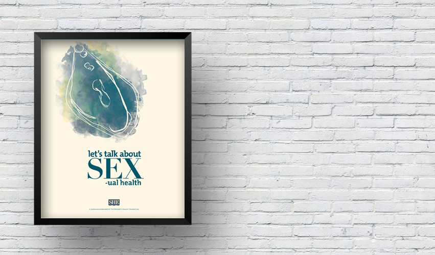
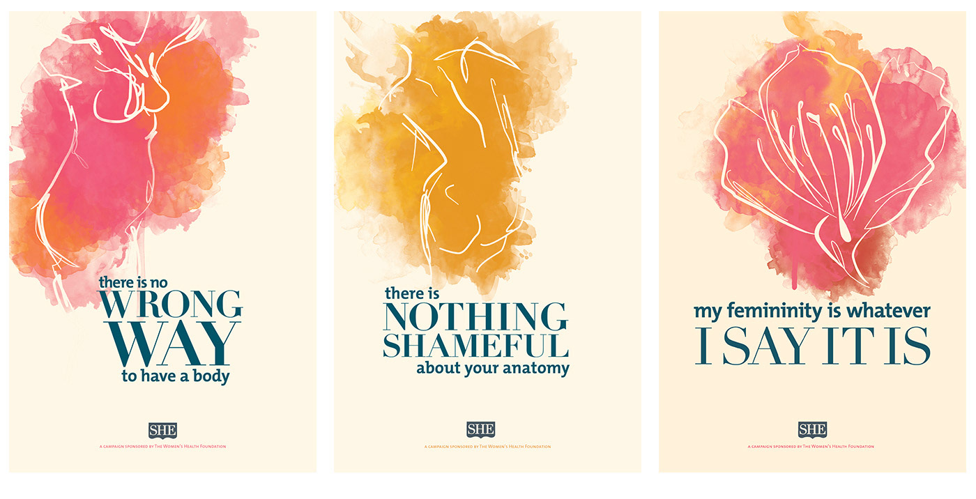
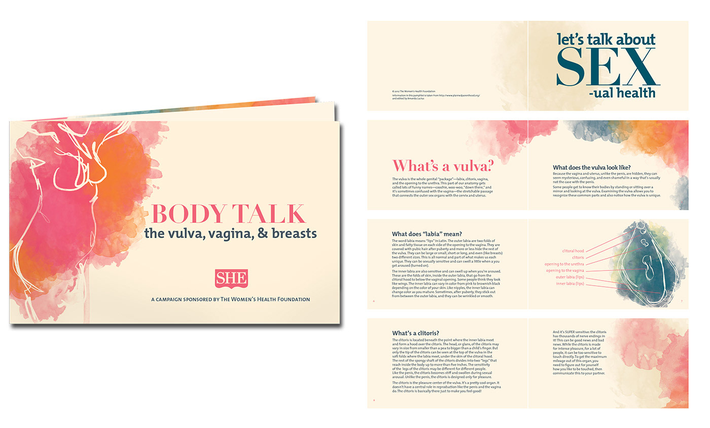
For the purposes of my project, I designed various print pieces to illustrate a basic visual system for what could become a much larger campaign. Shown here is a poster series and small pamphlet design.
Designer's Note: Two years after completing school and SHE, I revisited the project with a greater knowledge of life and intersectional feminism and made the following edits:
1. The new poster, “My femininity,” introduces a grey area to the conversation. “She” is now defined by the individual. The decision to visualize this idea with a flower reinforces this openness. The male and female parts of the flower are clearly shown and function as a nuanced illustration of gender neutrality.
2. The content of the pamphlet was edited to include gender-neutral language. The title, “the female body” became simply, “the vulva, vagina, and breasts”. The vulva definitely still needs to be talked about, but not in the context of defining being female.
SHE was never meant to be extensive. I'm a graphic designer, not a sex educator. So the campaign should always exists as a small part of what could be a bigger whole: an entire platform and community of educators and young people learning about their bodies and celebrating “girl power”. With the small changes I've made to the original project, however, this sampling is now more indicative of what the larger campaign could be.